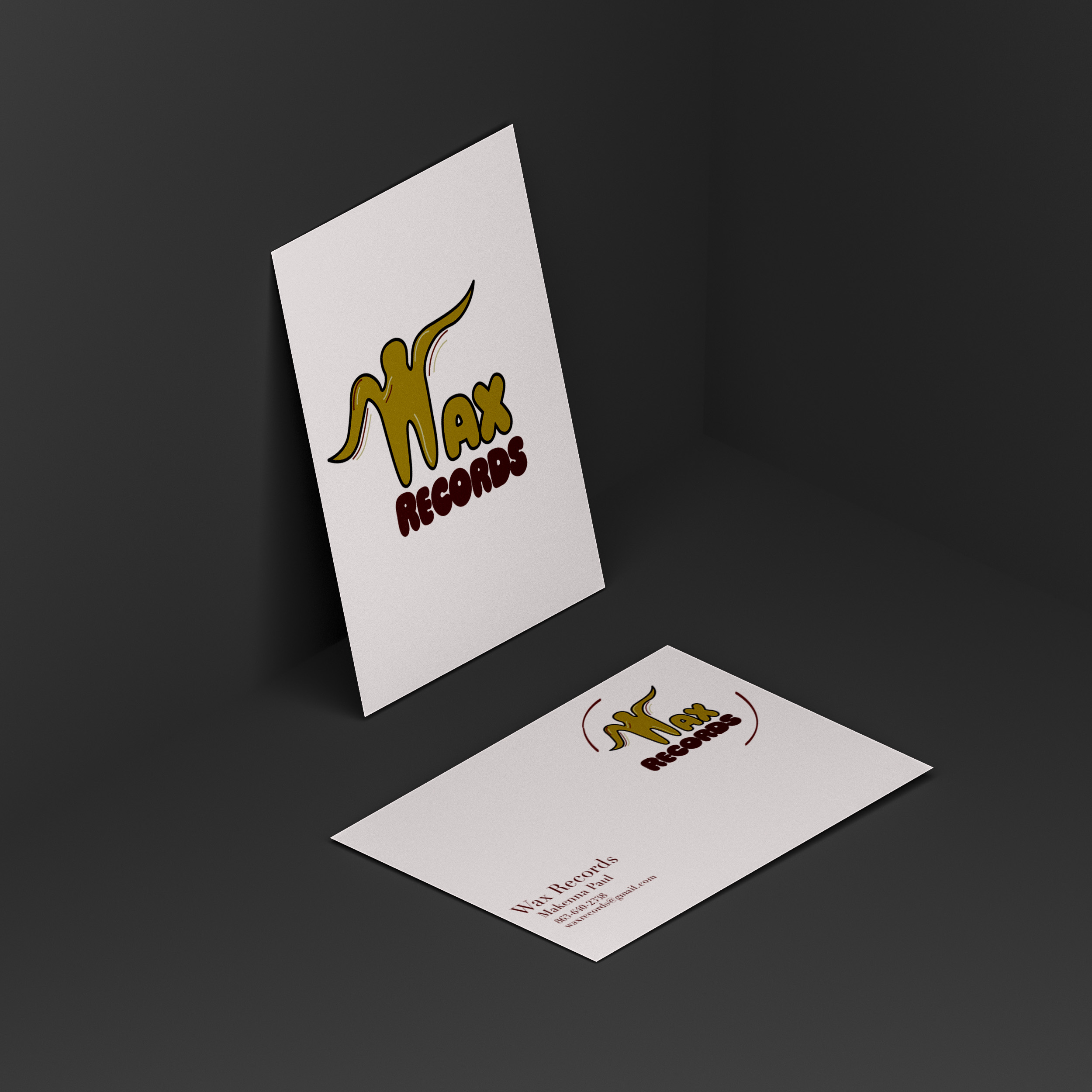
Wax Records
This project was a letter mark I created for a record store. This design features an eclectic color palette and line work on the “W” to mimic the grooves of a record.

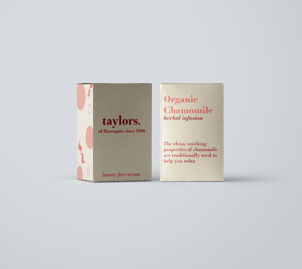
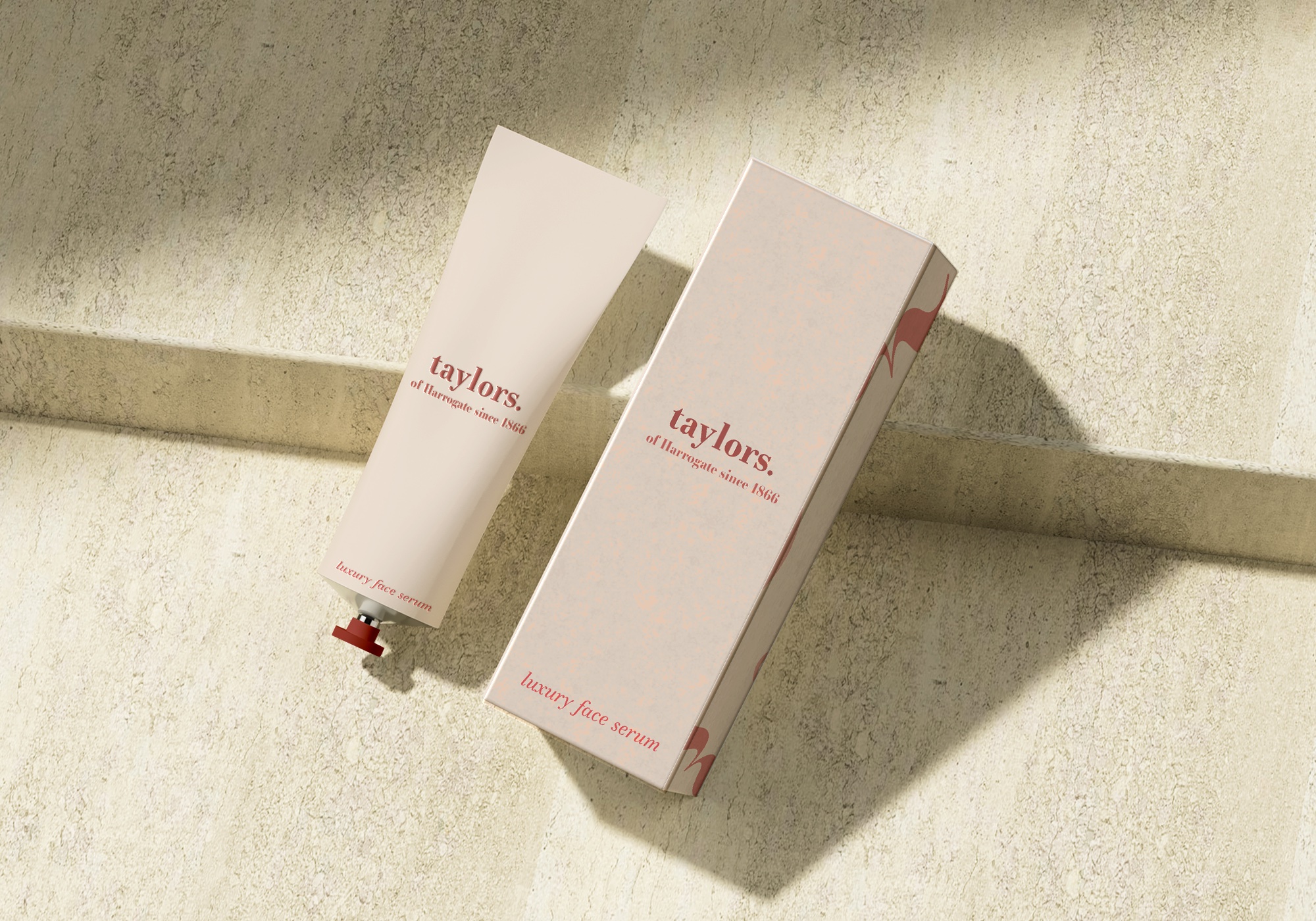
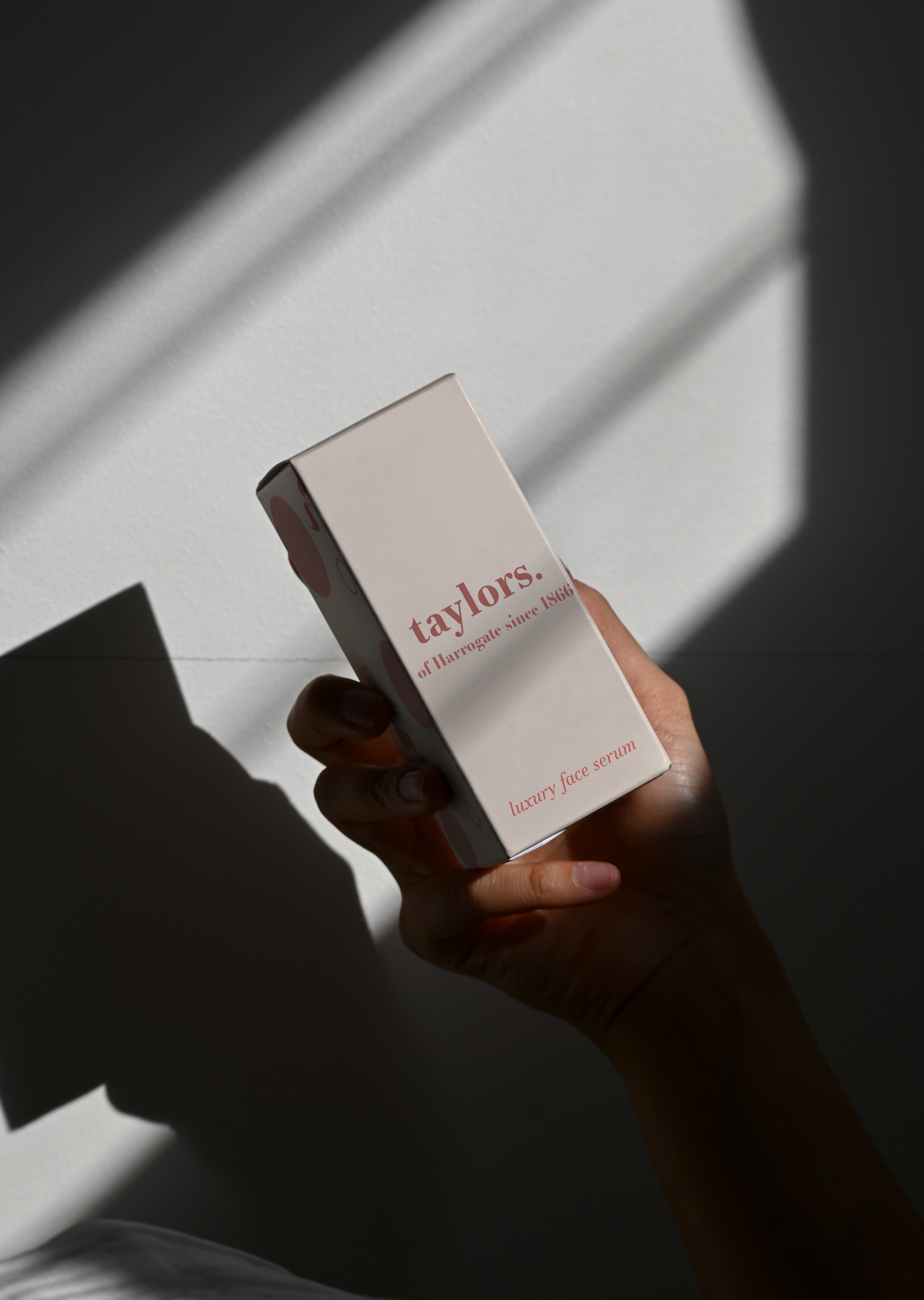
Taylors Reimagined Packaging
For this project, I took the tea brand “Taylors of Harrogate” and turned the packaging into a skincare brand called “Taylors”. The goal of this project was to use only the text from the original package and make it fit content wise. I went for a more modern design and opted for a monochrome palette to fit these themes.
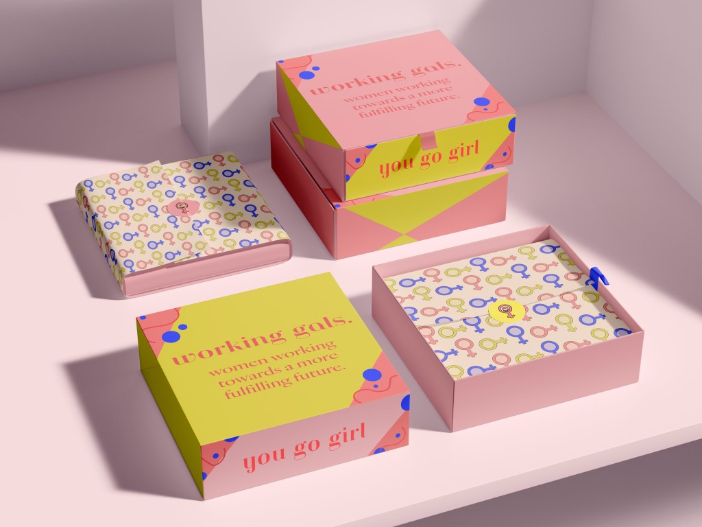
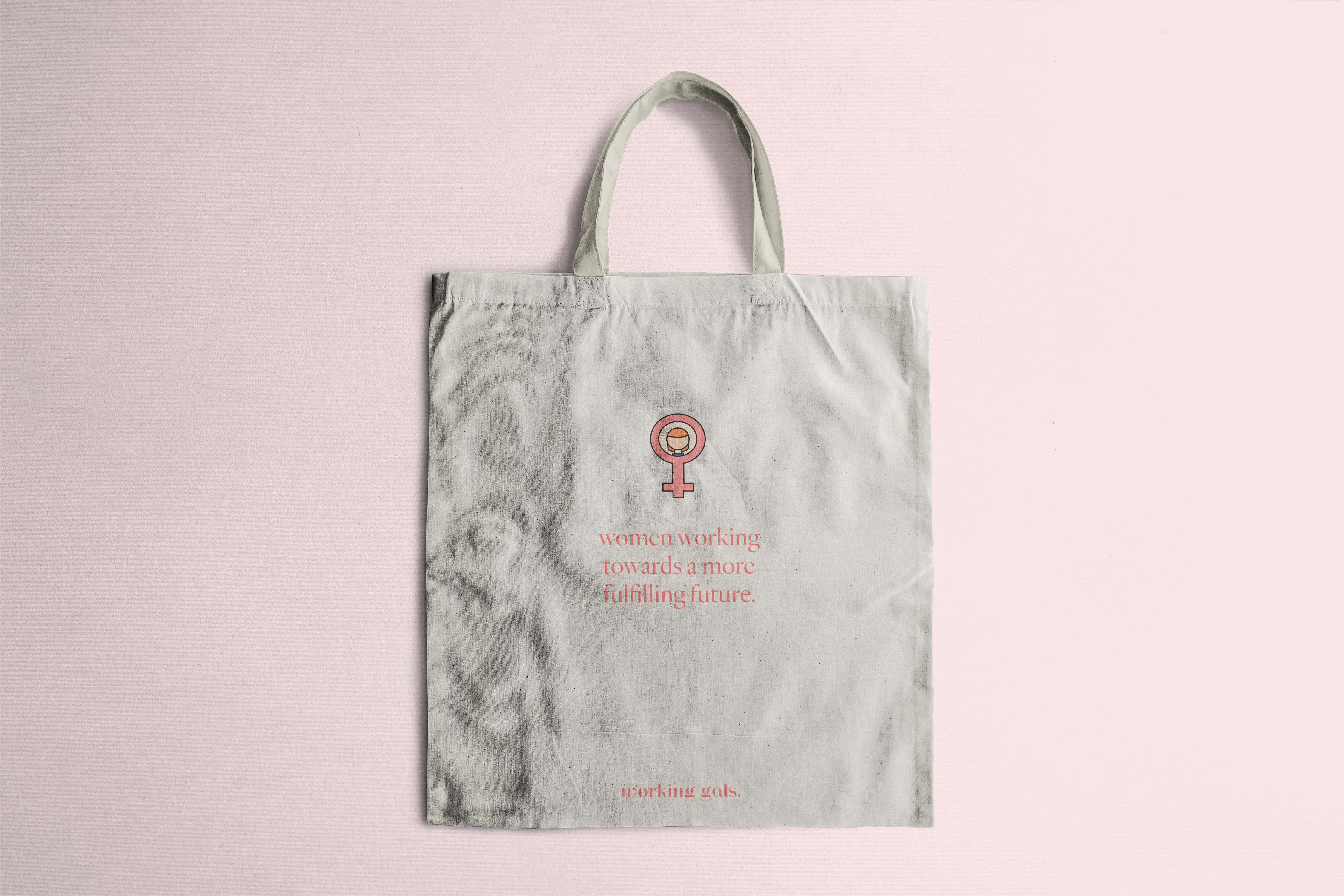
Working Gals Packaging
For this project, I experimented with witty and inviting phrases for the packaging and selected colors that would stand out. I wanted this packaging to feel bold and quirky.


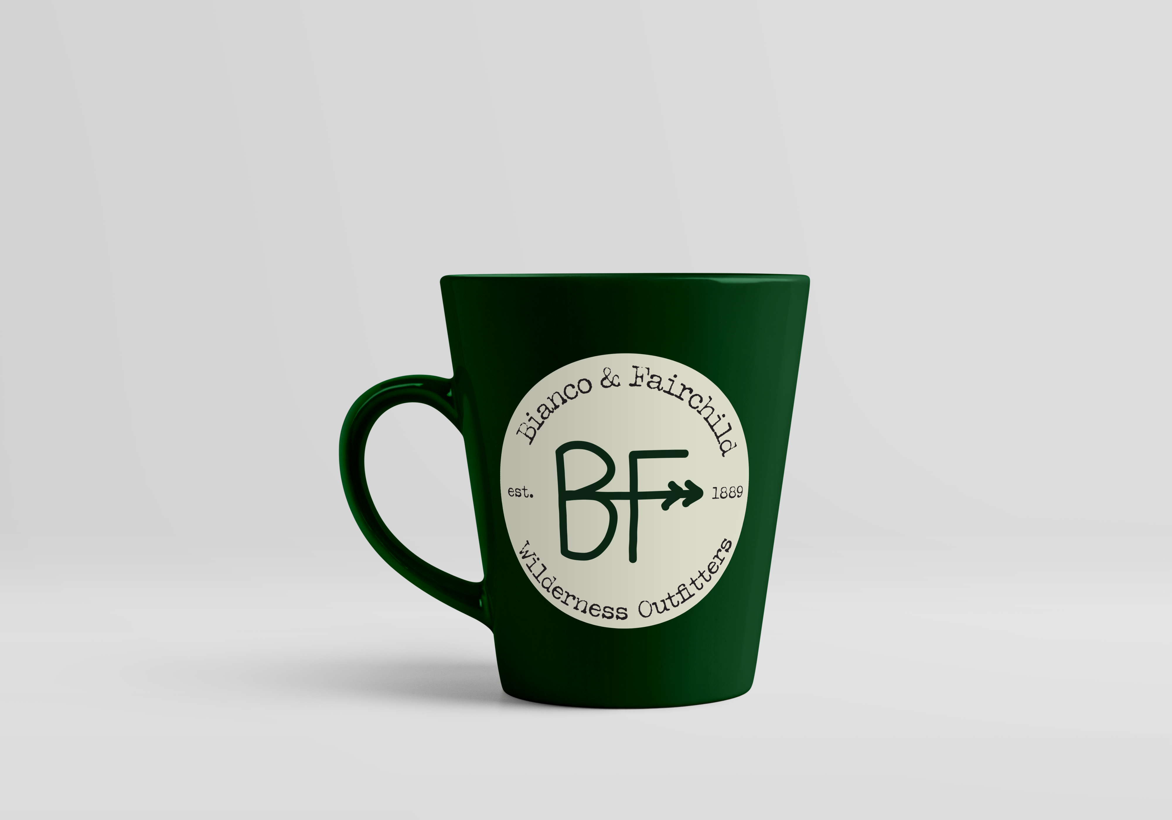
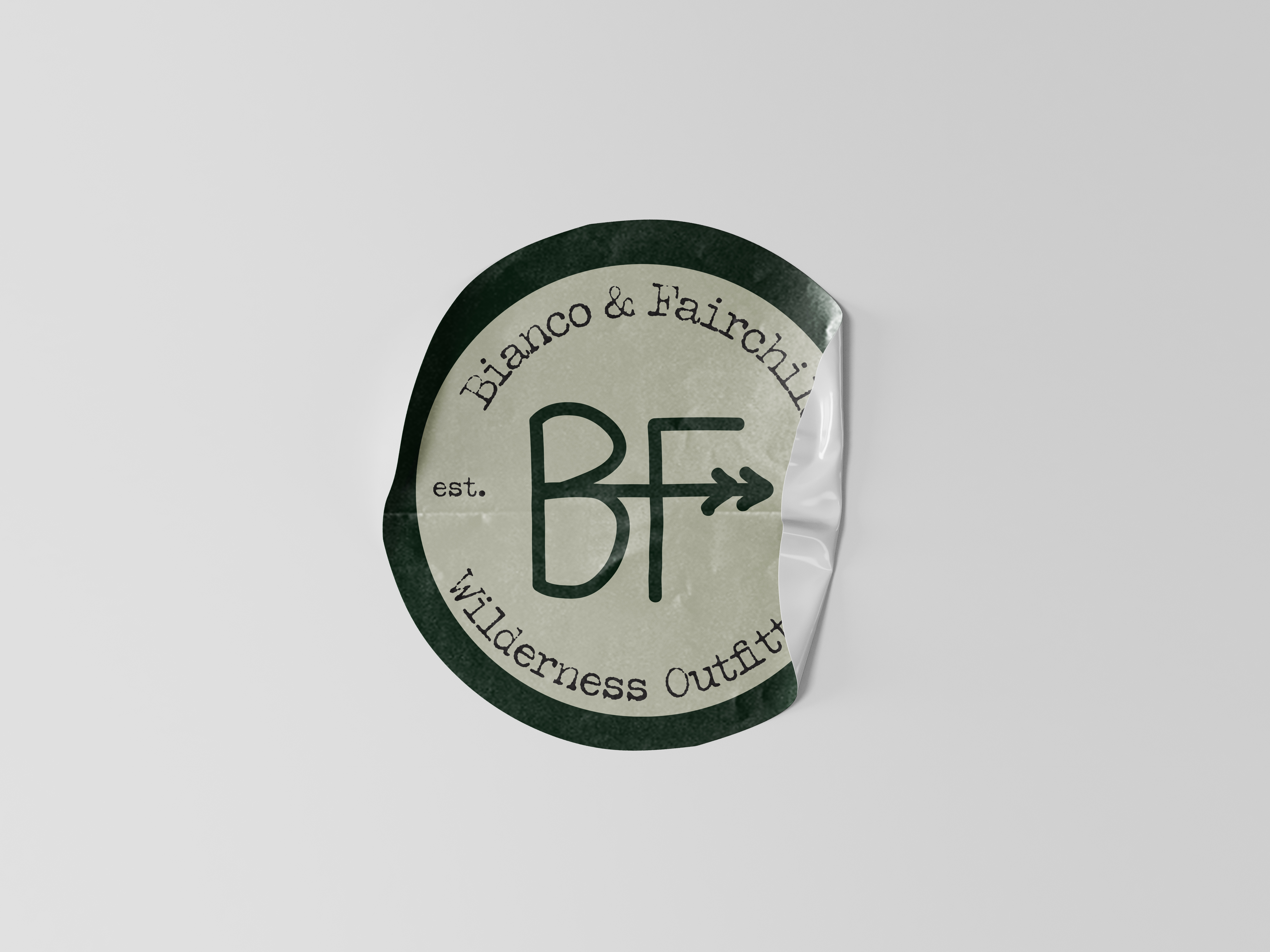
Bianco Fairchild Packaging
For this project, I experimented with creating an ampersand for different companies ranging from luxury chocolate to wilderness outfitters while using the same name. I wanted this design to have a rustic outdoorsy feel and pulled inspiration from nature. With this in mind I tried to incorporate trees, greens, and a worn texture to the design.
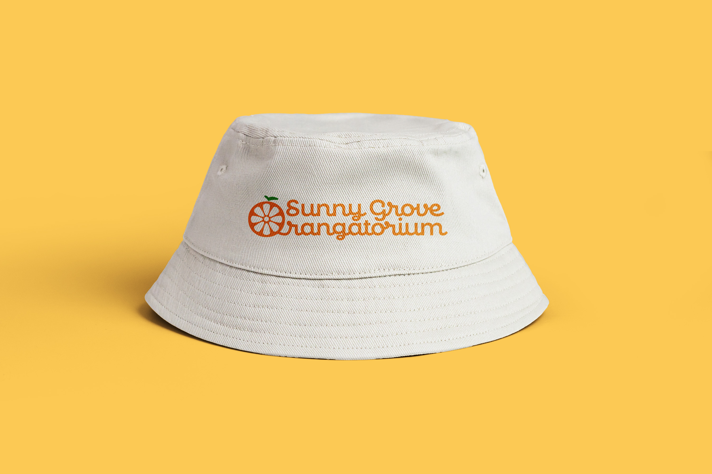
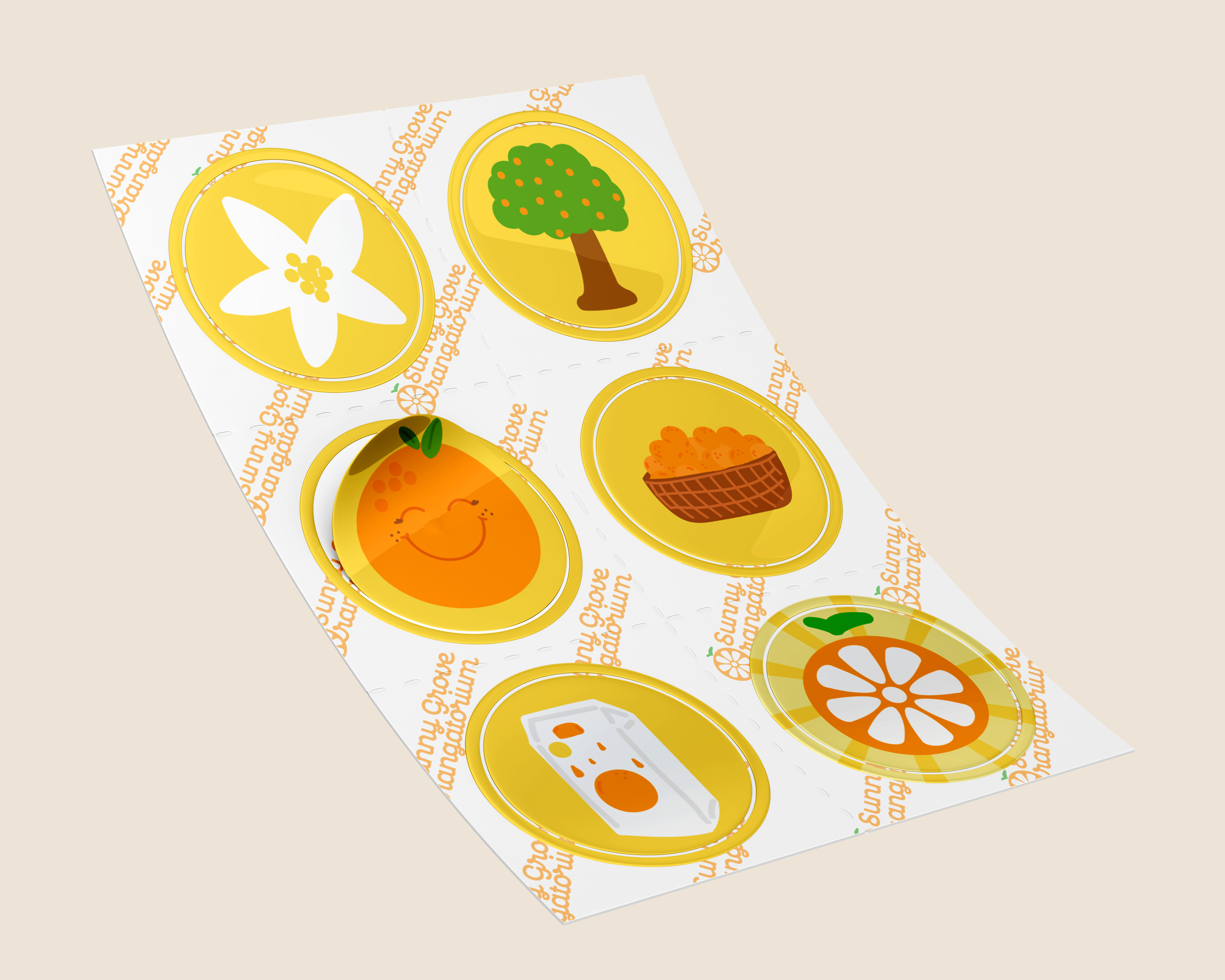
Sunny Grove Orangatorium
This project was based around a children’s museum named “Sunny Grove Orangatorium” that aims to educate children about the orange production process in an interactive way. For this I created a sticker sheet for stations where when they complete all the stations they would receive an “Official Orange Inspector” pin.